Instafrenchie — Site vitrine
Redesign of Instafrenchie’s marketing website
- UI design
- Figma
- Webflow
Role and context
Redesign of Instafrenchie’s marketing website in 2024, after the launch of its client platform in late 2023. I designed the interface on my own; a developer built it in Webflow.
Problem
The old site predated the client platform. It presented the offer through a logo and a tagline, without ever showing the product.
Decisions
The product shown in the hero
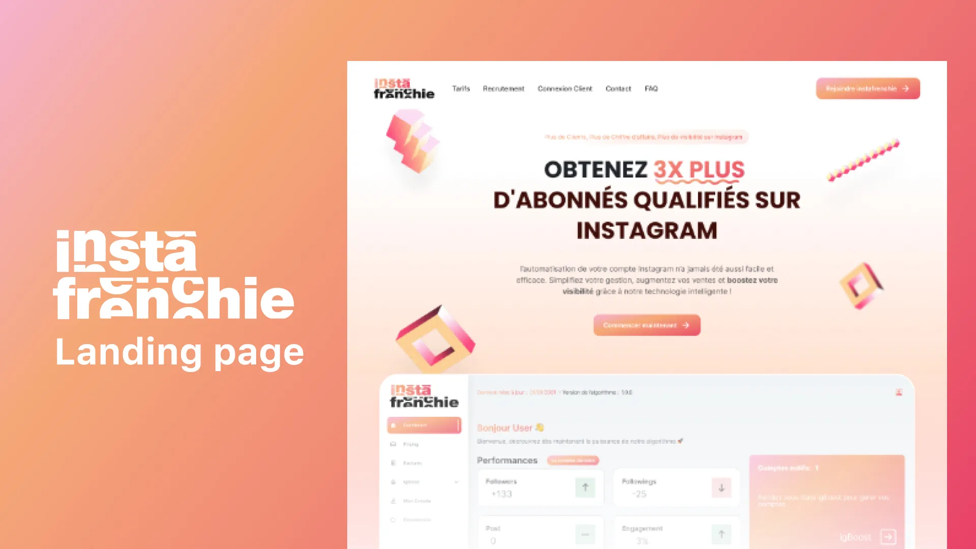
The old site introduced itself with a logo and a tagline. The new one shows the client platform right below the headline: visitors see what they are buying before reading the pitch. Three hero layouts were explored before settling on the one where the product sits below the title, full width.
A shared identity with the web app
Gradients, shapes and components are taken from the client platform: the site and the product read as a single world, and moving from one to the other comes as no surprise.
Client access in the navigation
A “Client login” link in the menu, next to pricing and the FAQ, connects the marketing site to the platform: existing clients don’t have to look for how to sign in.
Outcome
Designs built in Webflow and launched in 2024. The site has since been replaced by an entirely new version, unrelated to this work: it is no longer online.
What I would do differently
The hero promises “3x more qualified followers”: a sales promise that is hard to keep and to prove. Today I would push for concrete evidence — client cases, reviews — rather than a figure as the headline.