Intersport
UX redesign of the mobile e-commerce app
- User journeys
- Wireframing
- Figma
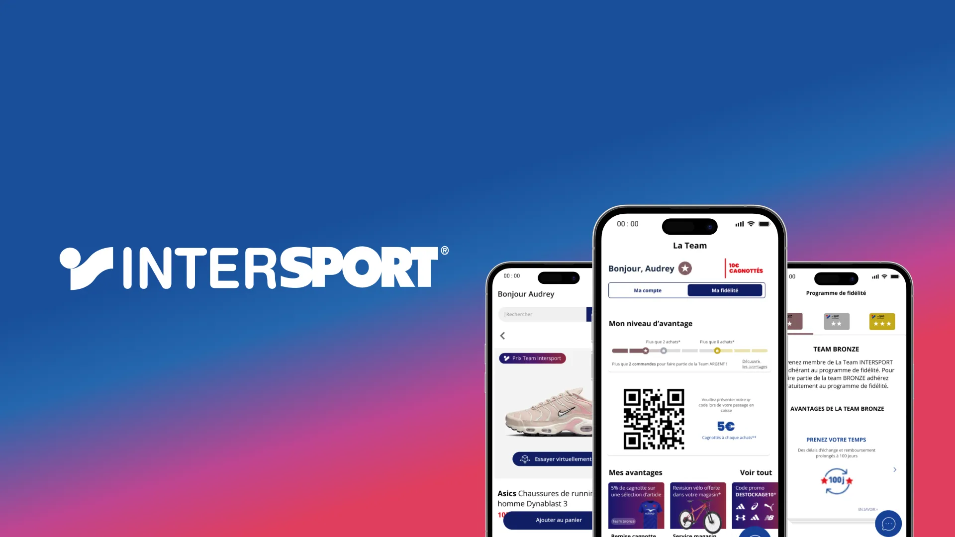
Role and context
A UX redesign of Intersport’s mobile e-commerce app, with an objective set by the brief: increase average basket size and smooth out the purchase journey.
Problem
The brief asked us to rethink the mobile shopping experience in order to increase average basket size and reduce friction in the customer journey.
Method
The project was run as a team, with a full research phase ahead of design: benchmark, consumer interview, personas and journey map. My contribution was mainly on the interface, with cross-cutting involvement in the rest of the project.
Decisions
Swipe-based product recommendations
A direct answer to the goal of increasing basket size: a like / not interested pattern for browsing suggestions on the home screen, rather than a static list.
Four-step checkout with saved state
Designed to reduce friction: if the journey is interrupted, previous steps stay saved and the customer can come back without re-entering everything.
Outcome
A complete Figma prototype covering the purchase journey, from product discovery to checkout, with recommendation and loyalty systems.
What I would do differently
The project relied on a single consumer interview. With more time, I would push for several interviews to cross-check profiles and make the personas more reliable, rather than generalising from one account.